So, it's been a couple of days since Microsoft pushed its brand-new dashboard to my Xbox Series X console, and overall, I have mixed feelings on the new Home experience so far. The vibe is there — I'm loving how much screen real estate my gorgeous Pentiment background gets post-update — but I still feel like there's work to be done, which is a bit disappointing given how long we've all waited for this rollout.
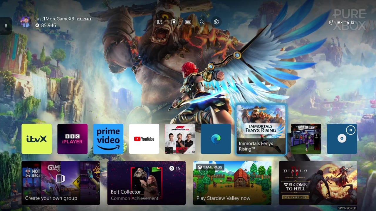
Team Xbox has been toiling away on this redesign for months on end, and the immediate results are positive. It's been said for a while that one major objective here was for the main home screen to fell less cluttered, and I reckon the changes here are largely a success. Icons are smaller, moving between them feels smoother, and the new quick access menu up top is lovely and convenient without getting in the way.
However, move below the main home page and things go south - and I don't just mean literally. As you scroll down you're greeted with loads, and I mean loads, of 'recommended' sections — from Game Pass titles to most played games on Xbox and even personal recommendations — and it all feels a bit 'algorithm-y' for lack of a better word. Xbox will say that it wants you to 'discover' new games, but, it's probably a bit much at the moment.
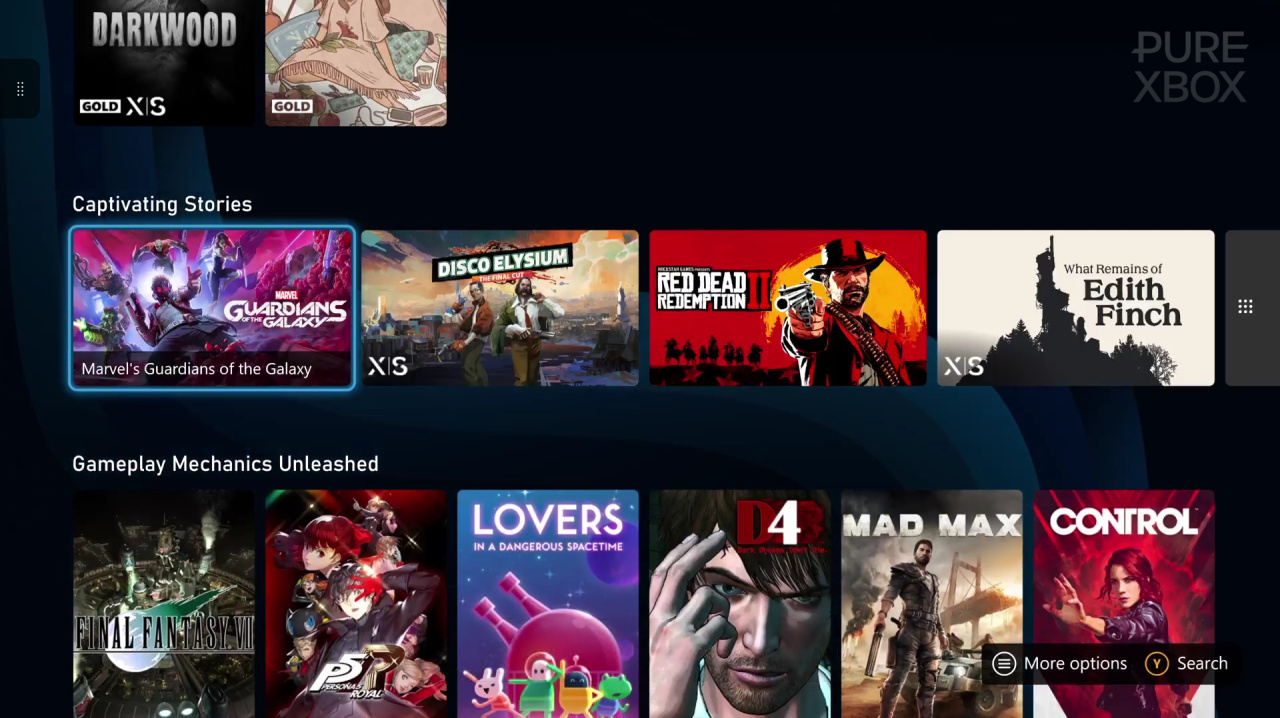
Don't get me wrong, I'm all for finding something that's right up my alley as a total surprise, but at the minute Xbox is pushing so many different curated tabs that I get lost instantly, and it feels like a big soupy mess of game and app tiles. If we could manage the sort of collections we're interested in — be it Game Pass additions, free-to-play titles, multiplayer games and so on — that would probably make the whole experience feel a bit more personal.
With the previous dashboard, it was a lot easier to manage those extra pages that sit below the main screen. You could add and remove pretty much any 'group' below the main home page, and personally I removed most of them. Pins were there for my most-accessed titles, I had quick links to Game Pass and Xbox Live Gold for those Free Play Days titles, and that was about it. I'd like Xbox to bring a similar level of customisation back to this new design.
So... I'm a bit conflicted on the whole setup right now. I'd say that I prefer the direction we're heading in because most of my time is spent on that top screen and the games it provides access to, but Xbox's 2023 dashboard does still feel like a 'direction' rather than the finished article. Here's hoping that Microsoft listens to the feedback and continues to work on its brand-new Home experience in the coming months.