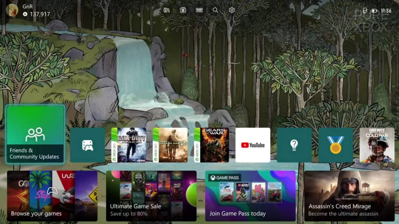
After months and months of Insider testing, Xbox's brand-new dashboard began rolling out to all users yesterday. The new Xbox Home has been redesigned to feel less cluttered, with backgrounds now taking up more of the dashboard view. But, what do you think of the experience so far?
We've only had a small chance to play around with the new UI for now, and while we like the new look, a few things are starting to stand out as potential problems. The fact that you can't seem to remove or reorganise most of the dashboard's extra 'groups' that sit below the main screen is a bit of a bummer so far.
We are digging the new animations though, the whole thing feels super smooth and the way the 'recent app' tiles maximise and minimise as you scroll through them looks lovely. When it comes to the new dashboard's main screen, we think the team has done a great job.