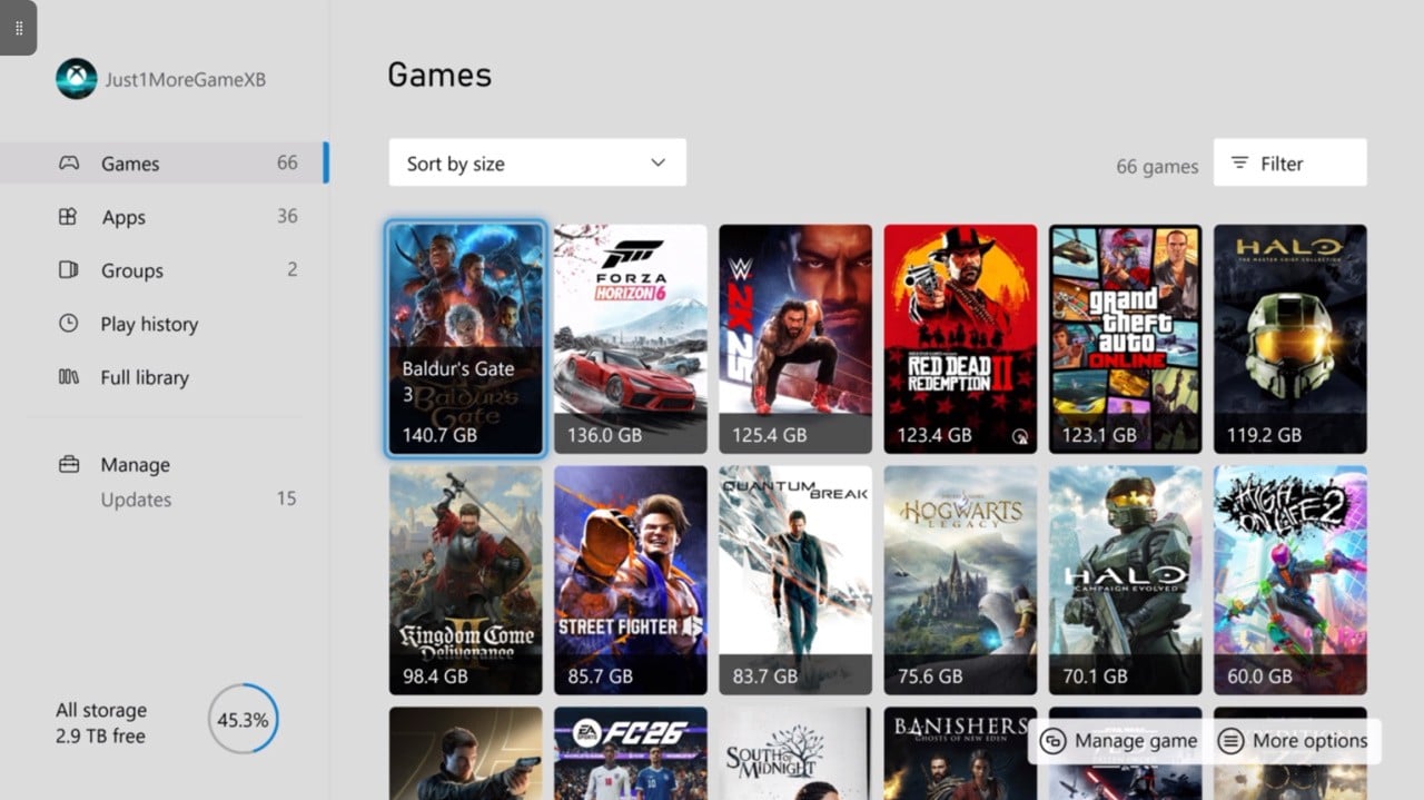
This is only a small change, but it's a sensible one - the new artwork is much more reminiscent of traditional box art, allowing us to see all the details on the front of the box rather than squishing it down into a square format.
If you're interested, here's how you can activate it:
- Go to "Settings" on your Xbox console
- Go to "General" and then "Personalisation"
- Scroll down to "Games & Apps"
- Choose "Poster" under the "tile style" drop-down menu
Personally, I don't see myself ever going back from this, but at the same time I can't really say that it makes much of a difference to my Xbox experience! A nice quality-of-life feature all the same though.
I did also change to the "Light" system theme in the process (as seen in the image above), and while I don't think I like it more than the "Dark" one, it's nice to have something a bit different for once. Will it stick? Probably not, but I think it's at least worth experimenting with - you can find it by going to "Personalisation" and then "My Colour & Theme".
Anyway, let us know what you think of the poster artwork in the poll and comments down below, as well as any other improvements you want to highlight from this latest major Xbox update.
Which Do You Prefer, Square Artwork Or Poster Artwork? (373 votes)
- Square13%
- Poster71%
- Don't have a preference either way!16%
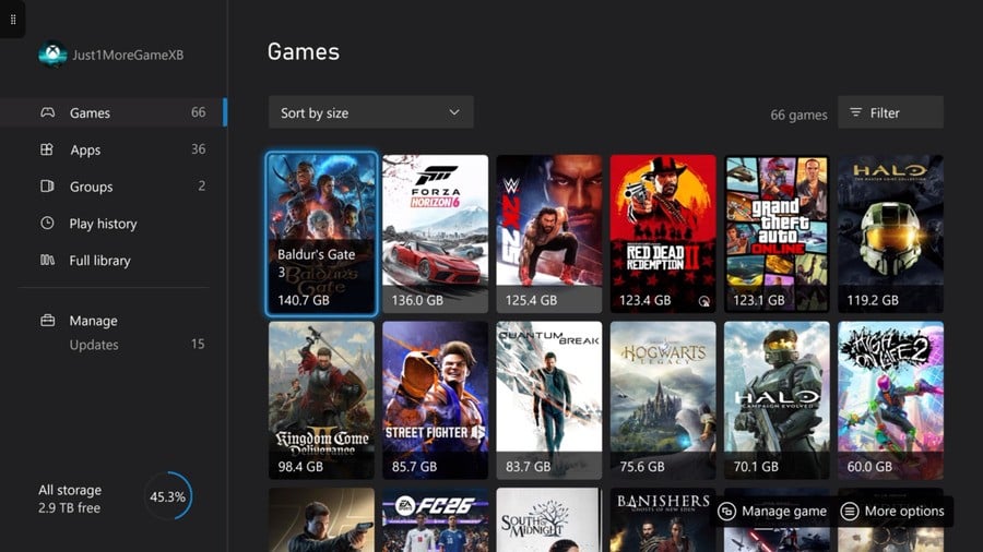 Image: Dark Theme (Poster Artwork))
 by
by