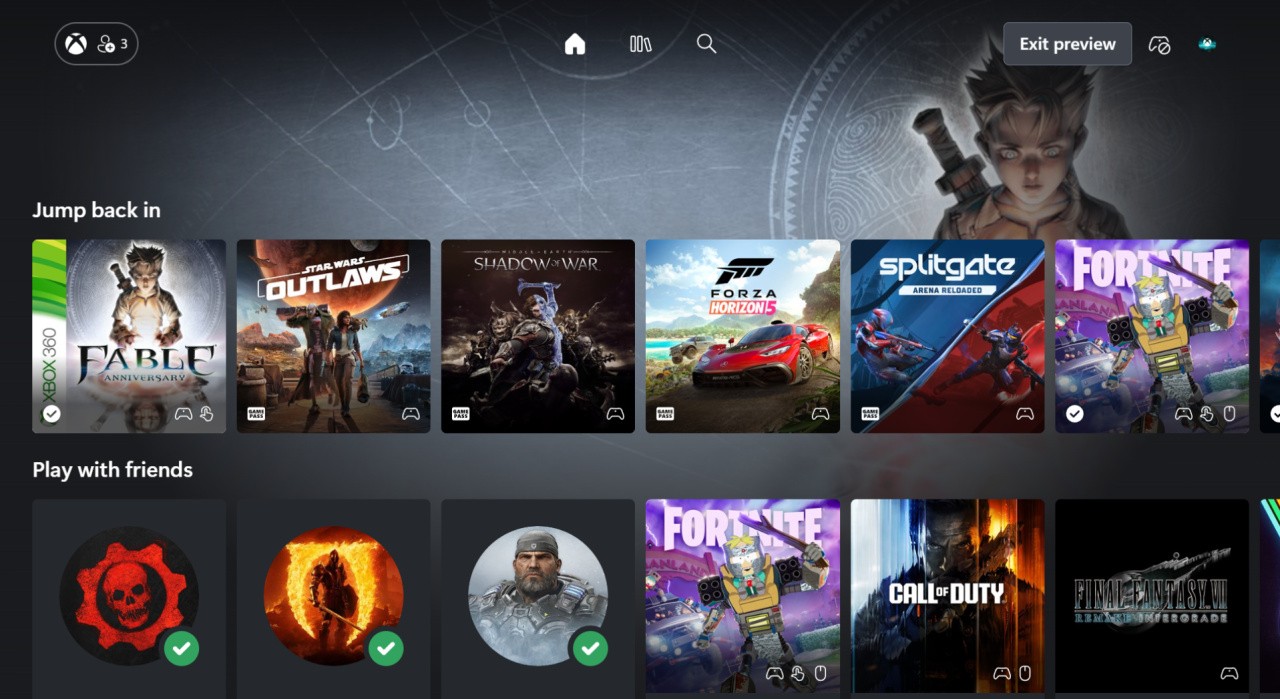
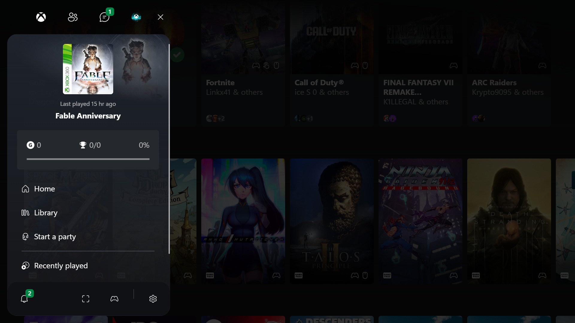
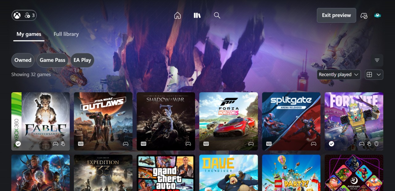
Earlier this week, Xbox unveiled a new dashboard for Xbox Cloud Gaming on the web, and it quickly attracted a bunch of attention — not only because it includes an achievement redesign, but because some people really like the UI in general.
The likes of The Verge and Windows Central have been highlighting this dashboard further over the past few days, as you can see in the video up above. The comments for that video are full of people suggesting the same design should apply to console, PC or both in the future.
Here are some examples:
"This should be the full screen experience".
"I hope this will be the interface for the Xbox app on PC in time"
"This looks cleaner and more sleek that what we even have on consoles imo."
You can see similar comments over on social media as well:
Keep in mind that we're referring to "some" people though — there are definitely others who aren't fans of how it looks, suggesting that the icons are too big and you can't see the background well enough, that it looks too much like a mobile interface, and even that it just seems "soulless" compared to what we have on console already.
Humourously, many have also pointed out that Xbox wouldn't dare add this dashboard to consoles in its current state because of its lack of adverts!
Regardless of how anyone feels about it, there's obviously some belief that this new dashboard could hint at the "future of Xbox console UI", but Microsoft has said nothing about this officially — and let's not forget that the Xbox Full Screen Experience has already been rumoured to serve as the main foundation of the next Xbox console.
We'll have to wait and see what happens — but in the meantime, let us know your thoughts on this dashboard below!