Yesterday, we highlighted the official Xbox Series X box art for Far Cry 6 and Watch Dogs: Legion, which you told us was mostly "OK" or "pretty good" in our poll. Some fans have also been taking to social media to share their attempts at creating Xbox Series X box art, and they're so impressive we thought we'd showcase them here too!
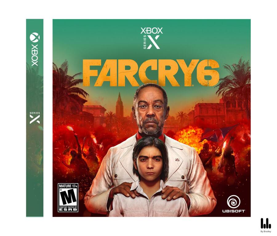
1. BaconBoyReddit on Reddit
This is a very clean looking design indeed. Its creator "believes cases should move towards a smaller, preferably square, form factor. It's less plastic, and frankly having that extra case space isn't necessary in this day and age."

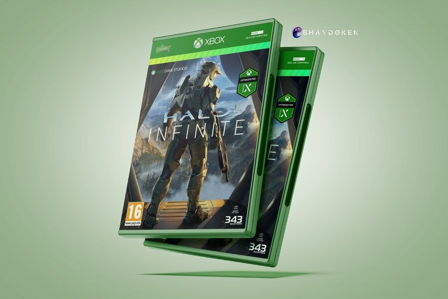
2. Shaydoken on Twitter
This smart concept is said to feature a green neon strip on all prints, and its creator suggests exclusives should have reverse holographic art as well. Cool idea if you ask us!

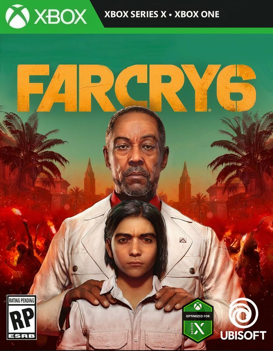
3. DaDomia on Reddit
This version of the Xbox Series X cover art is intended to make the design less cluttered than its official counterpart, as well as allowing you to see more of the artwork behind the logos.

Which of these designs do you like the most? Let us know in the poll and comments below.


Comments 10
I went for design 1. The second was good too. I just want something that makes the Series X games stands out a little more than the current gen ones is all. Not a large logo saying Series X like they're doing now, but even a subtle tweak would be better in my opinion
First one doesn't have the title of the game on the spine and the Series X logo would fade into any artwork that is too bright. Also, if he's worried about plastic waste, mebbe don't buy physical.
Two and three are nice, though the green strip on two is too bright and too big. So...three, for me.
@SuperKMx I'm edging towards three as well. It's very similar to the official design (which I'm a fan of), but gets rid of that overly large Optimised for Xbox Series X label. They're all very nice though.
Xbox needs a better team that is responsible for creating marketing material design philosophy even though most will buy digital copies.
Practically: I like the idea of smaller cases, as I mentioned before, but don’t want to split my XBox One and XSX collections, so small is a no go for me.
The second option looks too different, again, nogo.
The third one is close but forgets that the Xbox cases have their logo on the plastic, not on the paper, so again, not actually viable, although I like the “optimized for series x” stamp position and size better on it.
Third design also forgets that it still has the name “Xbox” literally 3 times on the top bar alone!
So can’t vote for any.
Still hoping that stamp is just a sticker over the shrink wrap.
all of the little logos and labels about optimization etc should honestly be on the back. But it only works if publishers decide to do more with their covers instead of just slapping the main character on the background.
They should be mini posters of wonder and excitement!
I just want the disc on the right side of the box. Not the left.
I voted #2. I love the classic look.
I voted for design 2, looks really good..
I voted #3, but my only issue with the official box art is that gigantic rupee occupying so much real state. If it's a sticker only, then we're gold.
Tap here to load 10 comments
Leave A Comment
Hold on there, you need to login to post a comment...