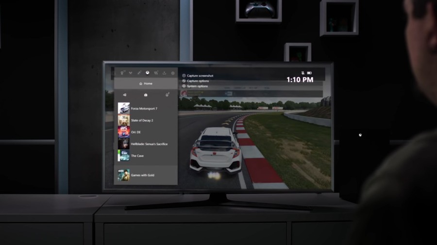
The user interface and hub menu of any new console is always an important part of the experience. Microsoft has continually strived to revolutionise its own dashboard each Xbox generation (as highlighted in our poll yesterday!), and with the release of the Xbox Series X on the horizon, you'd probably expect the same thing.
That may not necessarily be the case, though. According to The Verge senior editor Tom Warren, fans should "prepare for that to not happen" this time around, as Microsoft wants a similar UI across all of its platforms (Xbox One, Project xCloud and Xbox Series X). The company revealed various new features coming to Xbox Insiders on Xbox One recently, which could, at least partly, be in preparation for Xbox Series X.
Former Xbox employee and current community manager for Microsoft Edge Insiders 'Miss Quarry' responded to Warren (via Twitter), noting how users "begged" for the Xbox 360 dashboard to return when the Xbox One first launched – adding it would be a "smart move" to keep the existing dash for the coming generation.
I worked as Xbox support during the One launch. One of the biggest user problems was getting used to an entirely new UI and they begged for the 360 dash. I think this is a smart move on their part, tbh.
As highlighted by The Verge (and seen above), the most recent Xbox Series X dashboard Microsoft showed off was rather similar to the Xbox One dash as well.
How do you feel about the next-generation Xbox keeping the same style user interface and dashboard? Share your thoughts below.
[source theverge.com, via comicbook.com]


Comments 8
Microsoft has addressed this particular issue multiple times and confirmed that owners can return the hardware.
Microsoft won’t change the UI for the reasons stated in the article. While this makes sense, one of the fun new experiences of a new console is to see a new UI.
I think people complained during the Xbox One launch because the UI was terrible in 2013.
I don't think the original Xbox One UI was terrible, but the new UI irritates me everytime I use it simply because of the advertising space. I don't just mean the Microsoft advertising either, I've had several adverts appear on the home screen entirely unrelated to gaming or Microsoft.
I just want something simple and clean.
This makes sense considering Microsoft's development model lately.
I hated the Xbox one UI up until the most recent update.
Now it's actually pleasant to use. It would be a shame to scrap it right when it got good.
@Bobarino That's what I think. After all changes, the current UI is great and now I feel comfortable using it.
Current UI is great, as it's maintained a continuous evolution no real reason to drastically change it for the Series X. No doubt there will be a few small tweaks regardless.....
Gotta be honest. Not the biggest fan of their UI.
Don’t get me wrong it’s much better than it used to be. I hated panning over through the mixer section, it would always stutter and go slow...
But I can live with it. As long as it snappy and gives you immediate access to your game library without major advertisements or Mixer (which I would prefer to see buried in the options unless you want it out), it’ll work for me.
Tap here to load 8 comments
Leave A Comment
Hold on there, you need to login to post a comment...