We should point out from the get-go that the images you'll see in the below gallery are not in any way official...just in case you don't read the rest of the text. We just thought it was interesting and a job well done.
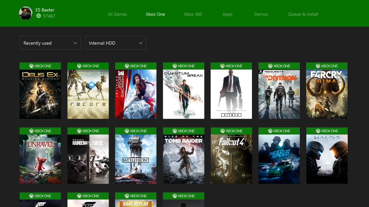
Reddit user ES_Baxter has been tinkering with Photoshop to put together a few changes that would improve the Xbox One dashboard user experience. We think what ES has come up with is pretty cool, with minor changes being made to some areas and major changes made to others.
We'd especially like to see some of the tweaks to the My Games & Apps section, including the extra filters, for sure. What do you think? Would any of this intrepid user's suggestions be on your wanted list?
[source reddit.com]


Comments 9
Not shabby at all
Good stuff.
So much better I'd be more than happy with this.
I DESPISE the games and apps section, the game squares are way too big, if you have an embarrassing amount of games like I do it takes approximately 3 days to scroll to the end. I was disappointed it didn't change with the new UI, this way looks much better
Nice article. Yea Microsoft needs to hire this guy.
@Utena-mobile In general you should be able to store things offline. I want to download Kill Bill on my hard drive cause streaming buffers too much, but it still isn't supported.
@KelticDevil Most of these ideas would be very welcome. I hope they do.
@A_BabyRed_Yoshi Totally agree - there is no reason for the images to be so large... and square! I'd much rather they took the approach this guy has and double/triple the amount displayed at once and make them look like the physical games too which would make the 'collection' experience all the more rewarding.
I also have a ridiculous amount of games and that was before 360 BC arrived... it does literally take forever (well about 2 minutes) to scroll through them. At the very least we desperately need categories or genres adding asap to make it usable.
I've got two external drives (plus the internal) so I've been splitting my games between the 3 drives to try and create some sort of order of it all but it's far from ideal.
Nice. Some very good ideas there. My main gripe with the Xbox One is the whole Games and Apps section. At times scrolling through all the games is a pain, it's easier for me to just say "Xbox go to Bla Bla Bla" BUT you have to have the phrase spot on as I found out with The Division and PGA Golf.
Tap here to load 9 comments
Leave A Comment
Hold on there, you need to login to post a comment...