It's fair to say the new Xbox home UI perhaps didn't get the reaction that the team had hoped for last week. Although initial feedback was somewhat positive in our poll here at Pure Xbox, a lot of Xbox Insiders who have been given access to the new dashboard have been submitting fairly negative feedback over at the Insiders Reddit community.
It's important to remember that Microsoft is using this opportunity to "learn how to create a more personalized home screen experience and address some of the top trends and fan requests", so in other words there's plenty of work still to do, and the feedback submitted by fans will ultimately help to shape the final design.
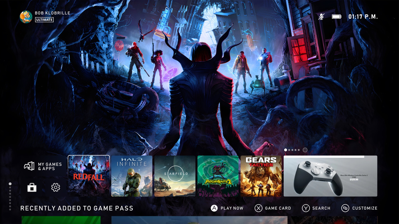
In the meantime though, we've been seeing a lot of concept designs over the past few days, so we thought we'd highlight some of them! The most talked-about dashboard has been the one you see above by popular Xbox community member Klobrille, but you can also find a few others below as well. Let us know which is your favourite!
How do you think Xbox can improve the new home UI? Let us know in the comments below.


Comments 18
Design is subjective and there is more than one way to do this.
Personally, as a UI designer, I don't like the cluttered Xbox interface, and I never liked the 'Metro UI' design premise that was meant to unify Windows, Mobile, Xbox, Kinect etc. That to me was a flawed premise, each with vastly different inputs, and screen real estate, necessitating different solutions not a one size fits all design ethos.
That said I appreciate that they have gradually improved the interface over the years and most importantly it is USABLE. Moreover it is the usable mess we all know. Until they decide to have a proper go from scratch - a hard task as you WILL lose features initially - I continue to appreciate the incremental updates.
Hire the fans!
Seriously though, this the difference between a UI based around needs, and a UI based around selling products.
Heh mixed? It’s terrible. Designed just to push gamepass on to you. It’s very very off putting and not a good look.
Even the fan made ones are keeping the ads 😩
For me I like the first one, can see 90% of your wallpaper and have access to your latest played games.
Well done fans showing a useless trillion dollar company how to do their job for their customers.
Perhaps you should all start making some AAA games for them. 😂
The first one with a cool dynamic background is what I'd like to see. I still have my PS4 with the Firewatch theme.
I would like a new fresh look, but I just don't sit on the dashboard long enough to lose my mind over it. I turn it on and play the game I turned it on for.
The first one is the best
Breaking things like they did with Windows 11 seems to be their new marketing slogan. This is the reason why we can't have nice things. They just take them away, just because.
So much un-needed clutter when the Pop-up menu has everything you need.
The best console UI ever created was the Wii Channels interface because it required no more than 2 clicks to start up anything. Lots of animation and character but also exceptionally tidy.
We just need a 4K version of that.
Anyone would think the xbox was designed for games and media.
Some nice edits here. At least there were no blades UI versions.
That's more or less what I'd like, to see my wallpaper fairly clearly, not having it plastered with things I never click.
So modern UI design is apparently having tiny tiles that let you see the background pictures. I mean these look fine, but not really actually useable. Most of these concepts use like 10% of the screen real estate. The new design is fine as long as it's snappy and lets me get into my games. It's a freakin launcher not an experience.
I'm still at a loss as to what their end goal is here. If they want me to use the console less, they're sure on track. It is already a nightmare trying to sift through hundred of installed games or even just the store.
It is embarrassing that pretty much every fan concept is better that what they can do with all their resources.
They're really gonna have to step it up, or this will be the last time I buy two flagship consoles. In my case two Series Xs. And I'll just go back to PC.
Whilst I appreciate that people like to see a background image, using 90% of your screen estate as an image viewer is not a good UI.
People like it because its less cluttered and that tells you this whole tile concept is not whats required for a complex ui design as there will always be too many elements.
Unless they completely rethink it Im not sure it will ever be what we all need, so small itteritive improvements are the best we can hope for.
Just copy ps4 ui with folder with no ads, it's that too hard for billions corporation like microsoft?
$500 for an ad machine. Anyone want my Series X?
Show Comments
Leave A Comment
Hold on there, you need to login to post a comment...