Here's a story we didn't think we'd ever be reporting on!
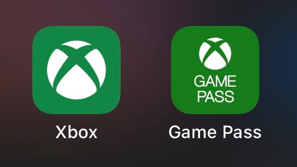
Ever since the release of the new Xbox mobile app for iOS users earlier this week, some fans have been pointing out a particularly off-putting aspect of its design - its shade of green is different from the other Xbox apps on the platform.
It's the end of the world as we know it!
But seriously though, it's a bit of a strange decision for the app to deviate from the standard Xbox colour scheme, although presumably it's done to differentiate between the different options... or perhaps it's a mistake!
In any case, people are a little bit miffed by the design choice:
Have you noticed this? Bothered by it? Let us know in the comments below.


Comments 19
The world really needs these consols to launch so thing's like this aren't stories
I have to be honest, it is incredibly annoying!
Just make the damn colours match 😂
Honestly I like the new colour, it looks more soothing to the eyes.
Little Timmy’s granny is also now gonna be colorblind.
Cancelling my pre-order.
Given 2020 is the way it is, I'm trying to be more discretionary on the things that frustrate me and this is far from making the list
Really? I have both and am not bothered.
That's it! I'm buying a PS5 now.
#1stWorldProblems LOL
Having worked in corporate branding, this is a big oversight. Presuming a mistake and will be fixed
I mean this hardly matters.
But then again it's 2020 so we're also 30 minutes away from someone claiming the change of green is to represent Ireland 2 hours away from someone else picking that up as support for "socialist health care" and 6 hours from someone declare MS a bunch of communists andby the end of the week we have some insane twitter fued between Trump and Spencer and someone refers to Playstation as "American console" and by the end of November Sony owns the white house using an cyborg Abraham Lincon.
@abe_hikura drugs can be good...but they can also be bad
I noticed this. More annoyingly the update got rid of achievements and the store! Hope they add all of those back in.
I noticed this different shade of green earlier today. I actually prefer it, not as luminous as the original.
They are either going to push out another update and revert it back to the original colour, or the Game Pass app will be next for the shade of green change.
@abe_hikura I’m already buying up any spare ammunition I can find.
I don't think this shade of green is new. They actually have been using this different shade of green for the Xbox beta app for awhile now. It's a black background with the sphere shaded with this different green.
I'm more annoyed because you can't buy games from it anymore, are they bringing another out for that purpose?
I’m having the same issue but with the Gears 5 icon. Why not just have the box art instead of an image of Dom and a green background.
So I noticed the different color green earlier today at work & it does actually annoy me. Lol.
@orionreplay
I agree! What were they thinking taking away the store & achievements? It makes zero sense. 🤦♂️
Show Comments
Leave A Comment
Hold on there, you need to login to post a comment...