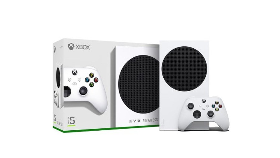
Following the release of the Xbox Series S a couple of weeks ago, some fans suggested that they weren't overly keen on the look of the system - specifically it's huge, black circular grate.
In an interview with Fast Company, Microsoft design principal Chris Kujawski explained that making the grate black instead of white (like the rest of the console) was actually done to "simplify the look":
“If you make the thing one color, you might think it’s simple. But [by adding black] we mask the hundreds of small holes here.”
Despite this, Microsoft reportedly debated different colours for the grate before deciding on the final design, and "worked hard" to get the fan in the right place to give the entire console "visual balance."
Do you like the design of the Xbox Series S, or would you have preferred something different? Let us know below.
[source fastcompany.com]


Comments 19
I think it looks fine, but like the rest of the internet I think they missed an opportunity to place their signature X there
@XBontendo couldn’t agree more. Having an X instead if the circle would have been perfect.
I do personally think its a very nice nice looking console and honestly, I don't really understand the hate towards any of the next gen systems and their designs.
@Jacko11 come on, the PS5 looks hideous! It's way too overdesigned and tacky looking, like those early and mid 00s pc custom cases.
@GamingGiant PS5 is tacky and huge.
On Series S, instead of a circular grate, an X-shaped grate would have been super cool.
@BlueOcean Also green. A big green X.
@GamingGiant It doesn't look bad, but it does look like a router.
@XBontendo I think it would have been considered an instant classic. A missed opportunity there.
I like the look of the Series S
@XBontendo
I completely agree! Putting their X on that black spot would have been perfect!
@GamingGiant
I agree! The PS5 is a hideous behemoth of a console. It looks like something out of a cheap sci-fi movie.
I dunno, I think the PS5 has a very traditional and iconic design style that fits right into it's intended placement.
Looks... ok... but if it had an X over the black grill thingie it would have looked amazing!
As it is right now it looks too much like a speaker. lol.
@NEStalgia
Haha! Well done.
I think it’s a good design. Its appearance is immediately recognisable and by emphasising the top vent it reinforces that it is in the same family as the series X.
@GamingGiant completely disagree. But you’re entitled to your opinion and thats cool. I like them all 🤷🏻♂️
@NEStalgia 🤣
Adding my hat into the ring and say that the X logo is a missed opportunity. Not to fear though, there will be someone on YouTube or Etsy who'll do it on day one.
It's not a bad looking console, it has a very clean look. Like everyone else has already said, it would have looked much cooler with an X logo on the grate.
I like both X and S designs. PS5 on the other hand... I just don't know what they were thinking.
Q) Do you like the design of the Xbox Series S, or would you have preferred something different?
A) I really like the Xbox Series S design and that addition of the big black grate was a good call. That said, I'd have preferred it if they went with a nice Xbox green to it. I like it when the companies emphasis their colours... then again, I'd admittedly prefer the entire system to be green (the fact that most consoles released come as only black or white has gotten rather boring).
Tap here to load 19 comments
Leave A Comment
Hold on there, you need to login to post a comment...