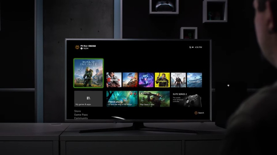
Microsoft has today unveiled the "New Xbox Experience" - a new, connected ecosystem across devices that "lets you play the way you want to play", launching with the Xbox Series X.
As part of this, we were treated to our very first look at the dashboard that will be shipped with the Xbox Series X when it arrives this November (it's also coming to Xbox One). As you can see, it has a more rounded look than the current design, and also is reportedly faster to load and uses less memory.
So, what do you think of the new dashboard? We've only got a few screengrabs to share with you so far, but take a look and let us know your thoughts in the comments and poll below.


Comments 17
Absolutely dig it. Don’t fix if it ain’t broke.
Looks good to me. I never get wowed or too annoyed by UI unless it's REALLY good or bad. SAP is an example of one that annoys me, greatly.
I don't know, since I haven't used it.
They ALWAYS look nice. But if it takes two minutes to change pages in the store or start a trailer, who cares?
The current UI is very decent and this is mostly improvement and polish. Nice anyway!
Looks very slick and simplified. I hate dashboards with too many things going on.
Looks really good..
@SuperKMx The trailer plays instantly in the new store.
If the new dash works as nice as the new store should be great
@Z3u5000
I completely agree.
I am a simple man. I see an ad on my dashboard and I hate it.
I generally dislike dashboard redesigns. They are too frequent. But I've been using some variant of this new one in testing. Everything loads faster, which is great.
I actually like the current regular UI, so them keeping it and improving it in many ways (along with the Guide seeming to be nicely streamlined) is great to me. I just hope they stick with it long term this time.
@AJDarkstar I honestly loved the blades dash and found it so easy to navigate. Would love an updated version.
The only thing I see different is the Gears 5 icon, that looks better than the current green thing we have now, maybe after i use it I’ll see a bigger difference
Looks good. Simple, yet effective.
Looks like a minor update on the existing UI. No complaints here!
I've only had an xbox one for a few weeks and I find the UI has taken a bit of getting used to. I found stuff on the 360 much easier to navigate. This one looks like more xbox one and I'm sure that, by the time I get round to buying one, I'll have mastered the current one so this one will be superb!
Tap here to load 17 comments
Leave A Comment
Hold on there, you need to login to post a comment...